Have you ever asked yourself what primary color corresponds to each elementary geometric shape (i.e. triangle, circle, square)? Have you ever wondered what might be the sound of color? What do you feel when you notice a symphony of colors on a canvas?
These are just a few examples of the many activities of the workshops conducted by one of the most influential Bauhaus masters, Wassily Kandinsky. In July 1922, Kandinsky accepted a teaching position at Weimar’s school of art theory, painting, sculpture, and craft, founded by Walter Gropius in 1919. The painter’s classes on ‘abstract form elements’ and on the analytical drawing were game-changers for the worldwide artistic community: Kandinsky’s didactics revolutionized not only Bauhaus’ philosophy of art but also the modern teaching system in the arts field.
Striving towards a direct involvement of his scholars during his lectures, the well-known Russian artist carried out a survey involving the entire Bauhaus community. The survey’s task was to prove the appropriate assignment of the primary colors yellow, blue, and red to triangle, circle, and square, respectively. And why is that? To answer correctly, I will deep dive into Kandinsky’s Form and Colour theory and the significant relationship between sound and color.
Point and Line to Plane: The primary pictorial elements and the ‘Color and Form’ theory
It is worthwhile to point out that the ‘diagnosis’ of the primary graphic-pictorial elements, such as the point, the line, and the plane, is of central significance to Kandinsky’s thinking, as expressed in his intriguing essay entitled Point and Line to Plane (1923).
To begin with, the geometric point represents the original component of the art of painting, as the outcome of the collision between the tool, used by the artist, and the material plane of the work of art. The point is an immaterial and invisible entity, it is the symbol of the not-being, which, once it is materialized, is equivalent to ‘0’. Since it is the most concise form of expression (“in relation to the greatest possible brevity”), such an element is the essence of silence, indeed it is obvious to believe that it does not produce any sound. Temporally, the point is attributable to an instant.
If an external force is applied to the “pictorial proto-element” (the point), the latter is torn away from its intense self-contained stillness and, hence, it is dragged on the underlying surface, leaving a trace of its movement. This gives birth to a new creature with an intrinsic dynamic nature: the line. Taking into consideration its classification, the horizontal line metaphorically depicts the “cold supporting base” upon which the human being stands; conversely, the vertical line is the image of height; lastly, the diagonal line must be the union of the two. This is the reason why they are the symbols of cold movement, warm movement, and cold-warm movement, respectively.
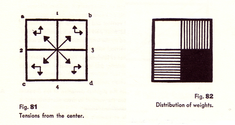
“The term ‘Basic Plane’ is understood to mean the material plane which is called upon to receive the content of the work of art”. The prototype of the Basic Plane is the square, which is delimited by a pair of horizontal lines and vertical lines. To be more specific, the horizontal line positioned ‘above’ raises an overall impression of lightness due to its upward tension towards the sky, whereas the horizontal line placed ‘below’ induces a feeling of heaviness owing to its greater closeness to the ground. Taking this into account, any pictorial object which is drawn near the line ‘above’ would tend to be perceived as relieved from its physical burden. Contrarily, the object’s proximity to the line ‘below’ would let it appear heavier.
Another fundamental pillar in the Aesthetic theories of Kandinsky is the ‘Theory of Composition’. The painter defines such a concept as follows:
“A composition is the inwardly-purposeful subordination
1. of the individual elements and
2. of the build-up (construction)
toward the goal of concrete pictoriality.”
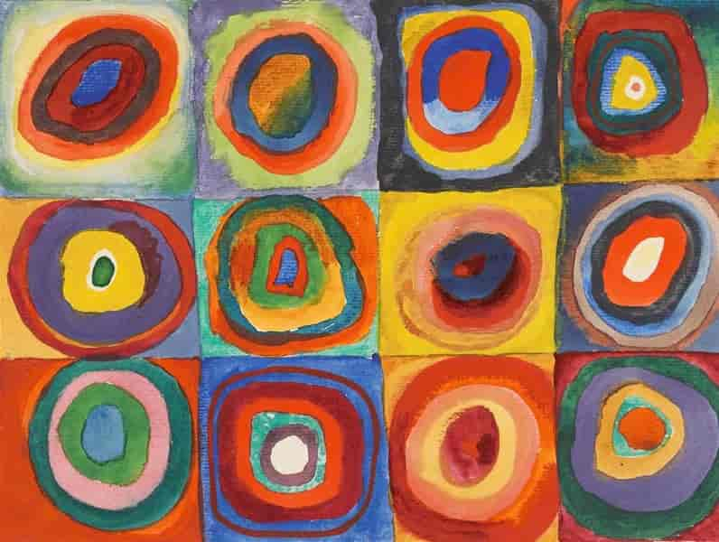
Thus, in Point and Line to Plane (1923), Kandinsky studies the interaction between the basic pictorial “individual elements”, such as color, form, and sound, in elementary combinations on the canvas.
The already-mentioned close ‘partnership’ between the geometric forms and the primary colors finds its proof thanks to the type of angles that make up such figures. For instance, the triangle, which is the outcome of the surface development of three acute angles, reminds us of the yellow color. Without the shadow of a doubt, as the edge of such angles provides them with the maximum tension, acute angles are the warmest and the sharpest, similarly to the yellow color.
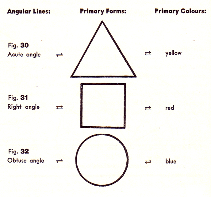
The more the acute angle widens, the more its tension loosens and the more the angle becomes obtuse. Consequently, a circle develops and the blue color is assigned to it since the progressive shape’s curvature suggests colder and more deep-toned colors.
The triangle and circle’s mediator is the square. The combination of warm and cold shades merges into the red color, the chromatic representative of the square. To be more clear, the red’s forceful nature corresponds with the inner tension of the square plane.
Concerning the Spiritual in Art: The marriage between Color and Sound
If you listen to the yellow color when you see it in a monochrome painting, would you feel a piercing metallic noise or a low-pitched serene melody? Well, Kandinsky tried to answer this question. He let colors playfully create symphonies in his mind, which was constantly tuned to multisensory dimensions. As soon as he saw shapes or heard sounds, he saw colors; when he saw colors, he heard music. This phenomenon is called Synaesthesia: the experience of one sense triggers the act of experiencing a completely different sense.
From the avant-garde artist’s point of view, the inner intrinsic tensions of colors are set free as musical harmonies. For example, the yellow color sounds like sharp and loud trumpets; red is matched with strong, harsh, and ringing trumpets; blue, the heavenly color, corresponds to a flute or an organ according to its tones.
Also, geometrical shapes possess their own inner sound and they are capable of interacting with the sounds of colors, enhancing or softening them. An illustration of this is a yellow triangle, in which the high-pitched sound of such color is further magnified by the cutting edges of the figure.
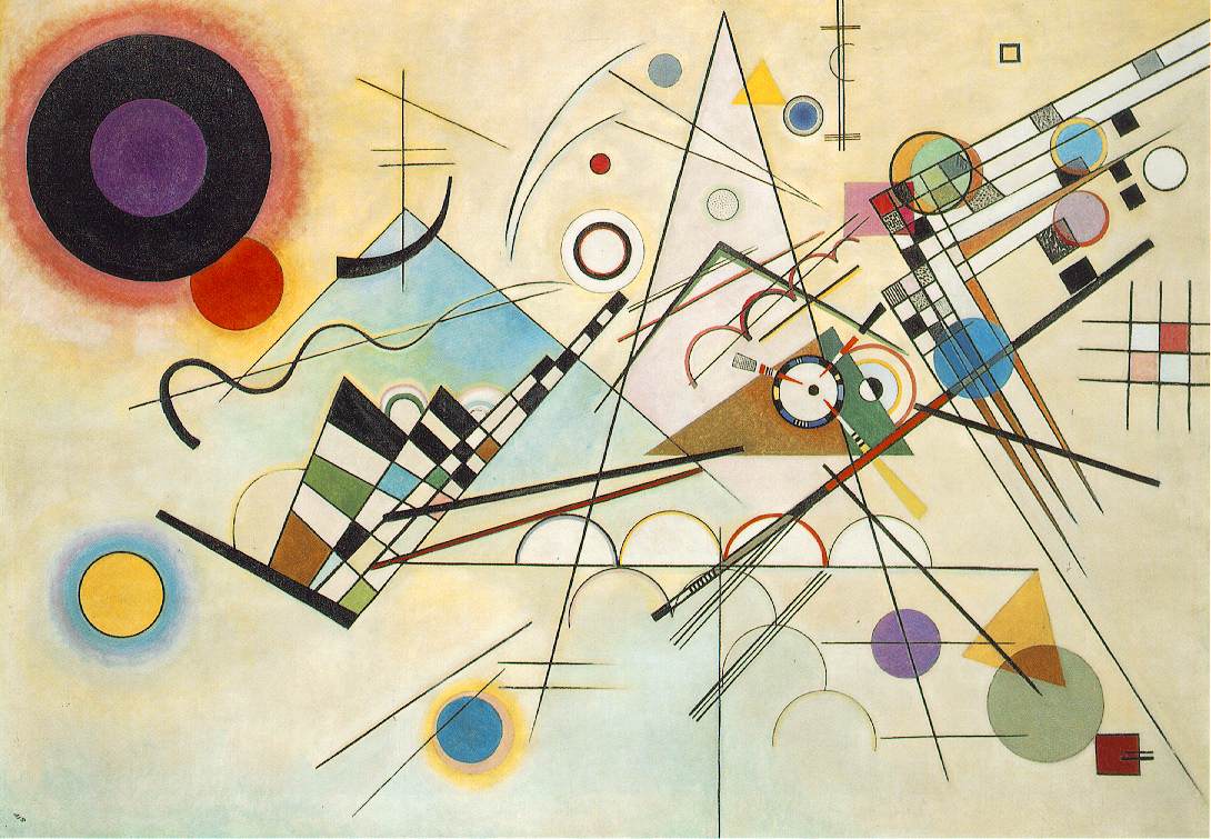
Let’s put in practice with Composition VIII (1923)
Looking carefully at the masterpiece Composition VIII, many relevant features can be identified thanks to the Colour, Form, and Sound theory.
Firstly, the work of art seems to be governed by a mysterious law of inner pulsation due to the constellation of circles of several dimensions and colors casually spread on the plane. Such diversity allows them to glisten with different sounds and a figurative orchestra seems to begin to play as soon as you encounter the painting.
As I pointed out previously, circles and triangles are opposing geometric shapes. Therefore, this multitude of circles is fully contrasted by the presence of the big triangle in the center. In addition, this discrepancy is further highlighted by the divergent juxtaposition of colors and forms. For instance, not all circular items are blue-colored and the central triangle is not yellow at all.
All things considered…
The association between color, form, and sound and the analytical study of the primary pictorial elements point, line, and plane were revolutionary. Kandinsky, together with the Bauhaus school, gave birth to a new era in 20th-century modern art, introducing non-figurative art to the public with an innovative approach.
From my point of view, his artistic aim is what made him a memorable artist and human being too. During his entire life, he attempted to establish a new science of art, capable of beginning a long-lasting dialogue between the artist, the work of art, and the observer. Thus, the detailed analysis of the art’s constitutive elements was the necessary tool to plunge into the canvas and to be part of the “élan vital” of the painting, as the philosopher Bergson would suggest.
Kandinsky advocated art that is nothing else than itself, an art that shows just its inner original impulse, an art that appears as a mere manipulation of colors, an art that goes beyond the visible and becomes the access door towards the invisible, the metaphysical. Indeed, according to the pioneer of modern abstract art,
“Not everything is visible and tangible, or—to be more explicit—under the visible and comprehensible lies the invisible and incomprehensible.”
Further readings:
- Punto Linea Superficie by Wassily Kandinsky; Biblioteca Adelphi 16, 1968
- Lo spirituale nell’arte by Wassily Kandinsky; SE Editori, 2005